Alot of people have complained that sagittal is hard to write but I'm developing a method to easily write any symbol as well as developing a sagittal calligraphy method, but thats less important hehe.
Here I just sketched out how I think I would write the glyphs.
Handwritten sagittal
-
- Posts: 45
- Joined: Mon Sep 21, 2015 9:27 pm
Handwritten sagittal
- Attachments
-
- image.jpg
- (867.5 KiB) Not downloaded yet
- cam.taylor
- Posts: 51
- Joined: Thu Sep 03, 2015 11:55 am
Re: Handwritten sagittal
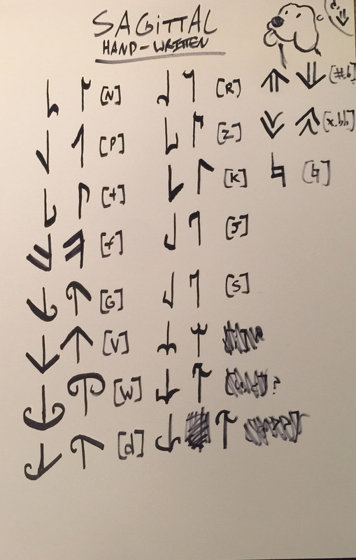
Looks good. You've just made one mistake with "gai" which you've notated as "dai"
As for the ones you haven't named, is "ranai", is "sanai" and is "janai", but I don't think they have short forms.
P.S. For Japanese speakers I really liked how , the 13-L diesis is DAI=大, so I can finally remember which one's which!
As for 14:13, many microtonalists would argue IT'S NOT a typical minor second, but rather a small middle second. 14:13 is notated as a minor second, a じゃない minor second! Teehee
-
- Posts: 45
- Joined: Mon Sep 21, 2015 9:27 pm
Re: Handwritten sagittal
haha, the way you can use Japanese to write these accidentals is great, especially Dai being the big thing! haha easy to remember for us and Japanese speakers Ok yeah, I see the mistake there
Last edited by Dave Keenan on Fri Dec 04, 2015 6:03 pm, edited 1 time in total.
Reason: Restored after accidental edit
- Dave Keenan
- Site Admin
- Posts: 2180
- Joined: Tue Sep 01, 2015 2:59 pm
- Location: Brisbane, Queensland, Australia
- Contact:
Re: Handwritten sagittal
I love seeing how other people write the sagittal symbols. The different interpretations of the strokes. I look forward to more font designers trying their hand at them, and seeing how they might evolve with time, hopefully making the 4 different flag types more distinct from each other in the process. I like the ways that William's calligraphic version makes the convex and concave flags really convex and really concave so they are very distinct from the straight flags. Although the wavy flags are possibly not as distinct from the convex flags as they could be.
Here's some advice I once gave to someone just starting out with handwriting Sagittals and finding it difficult to make them sufficiently distinct.
It may help to consider all four flag types in a "squared-up" form like this (downward-pointing):
|
|/ straight barb
|
|_| convex "arc"
|
|‾i concave scroll
|
|--' wavy boathook
Then as you hand-write them in this squared-up form, the corners, other than the one where the flag meets the tip of the shaft, should naturally become slightly rounded, so they will more resemble the flags in the font.